Logo Typography Exploration
Objective
Design and develop core brand elements for the law firm Matthews-Pourasef PLLC.
Core Values
Compassion
Client Focus
Expertise
Trustworthiness
Brand Voice
When it comes to specific aesthetics, Matthews Pourasef PLLC needs to offer a sense of familiarity and sturdiness of an experienced law firm, while at the same time standing out from its competitors through its focus on compassion, expertise and transparency.
TYPEFACE SELECTIONS
01
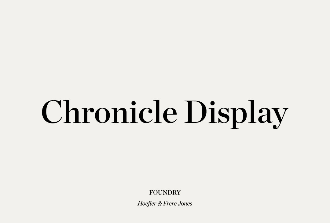
CHRONICLE DISPLAY
Hoefler&Co
A vigorous hybrid of time-honored forms and contemporary design strategies, Chronicle Display is a suite of headline faces that brings strength and utility to the classic serif.
CATEGORY Serif
TAGGED Classic, Contemporary, Simple, Strength, Utility, Versatile, Warm
02
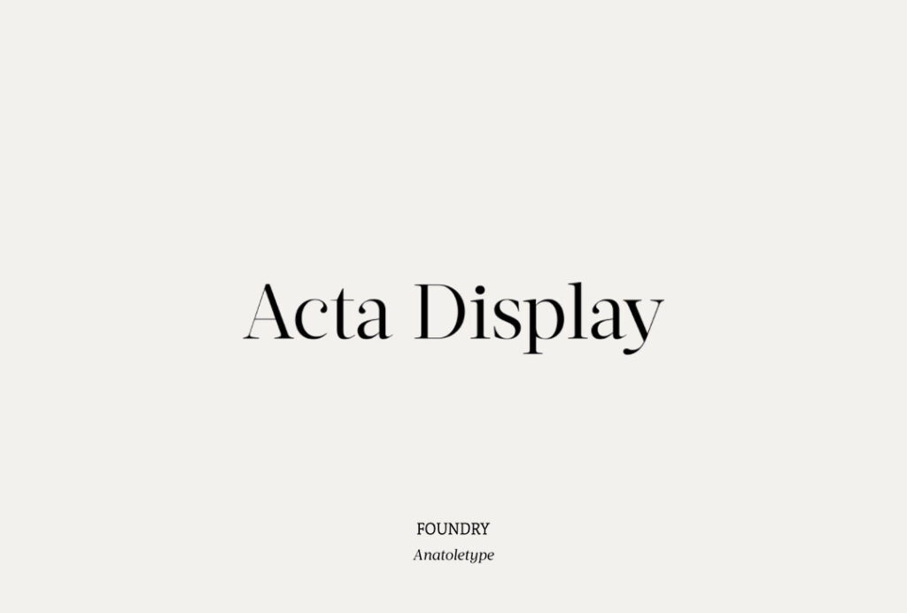
Acta Display
Anatoletype
Acuta is a serif with a good readability and a contemporary, robust look thanks to its low-medium contrast. The differences between thicks and thins are less strongly marked than in oldstyle text faces; yet the diagonal stress needed to facilitate reading is partly provided by the letter shape itself: sharp angles and italic construction give the right dynamism to the text.
CATEGORY Serif
TAGGED Contemporary, Dynamic, Humanist, Modern, Versatile
03
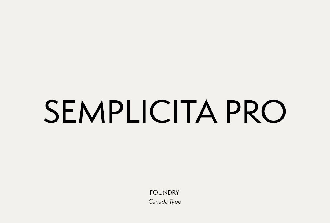
SEMPLICITA PRO
Canada Type
Semplicita Pro is a 21st century take on the seminal 1930 Nebiolo design that expertly replaced the cool Teutonic geometry of Futura with the warm, humanist, calligraphic letter forms characteristic of the Italian Renaissance.
CATEGORY Sans-serif
TAGGED Avante Garde, Business, Classic, Clean, Clear, Contemporary, Friendly, Geometric, Minimal, Modern, Simple, Utility, Versatile
04
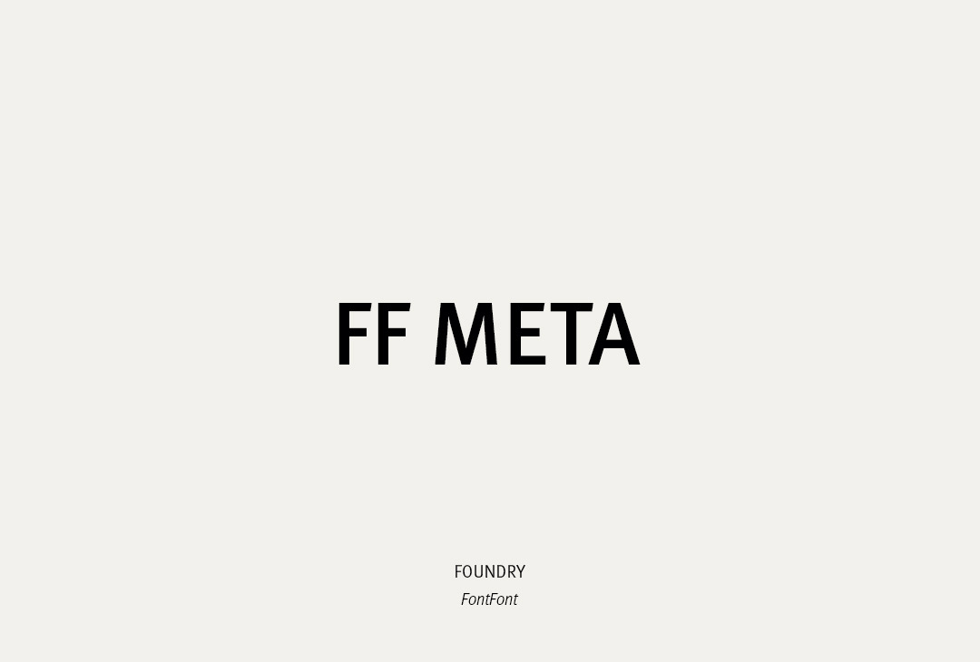
FF Meta
FontFont
FF Meta is a humanist sans-serif typeface family designed by Erik Spiekermann. As desktop publishing flourished in the early 1990s, the typeface quickly entered widespread use due to its clean, and distinctive aesthetic, and its ability to serve well in multiple design capacities including signage and correspondence.
FF Meta was intended to be a “complete antithesis of Helvetica”, which Spiekermann found “boring and bland”.
CATEGORY Sans-serif
TAGGED Clean, Clear, Commercial, Contemporary, Corporate, Humanist, Legible, Simple
REFERENCES