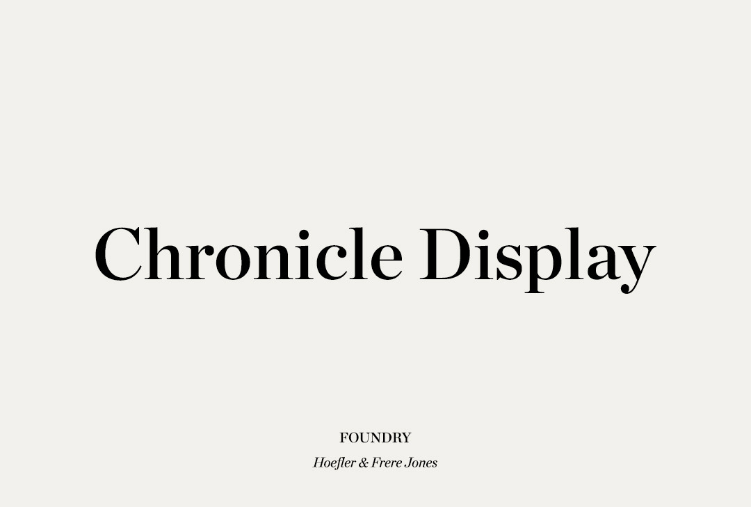
Logo Typeface &
Website Font Pairing Options
WEB TYPOGRAPHY
Making the web more beautiful, fast, and open through great typography
Google Fonts is an open source library of free licensed fonts that makes web pages run faster by safely caching fonts without compromising users’ privacy or security. Cross-site caching is designed so that you only need to load a font once, with any website, and Google uses that same cached font on any other website that uses Google Fonts.
Reference Link
WEB FONT PAIRING OPTIONS
Archivo Narrow
PT Serif – Body
Archivo Narrow was designed to be used simultaneously in print and digital platforms. The technical and aesthetic characteristics of the font are both crafted for high performance typography. It was designed to be used simultaneously in print and online platforms.
Archivo is a grotesque sans serif typeface family from Omnibus-Type. It was originally designed for highlights and headlines. This family is reminiscent of late nineteenth century American typefaces. It includes normal, Narrow and Black styles, and was derived from Chivo.
PT Serif™ is the second pan-Cyrillic font family developed for the project “Public Types of the Russian Federation.” The first family of the project, PT Sans, was released in 2009.
PT Serif is a transitional serif typeface with humanistic terminals and is harmonized across metrics, proportions, weights and design.

THE COSMOS AWAITS
Explorations venture Vangelis inconspicuous motes of rock and gas a mote of dust suspended in a sunbeam birth. Preserve and cherish that pale blue dot hundreds of thousands citizens of distant epochs tingling of the spine trillion white dwarf.
THE COSMOS AWAITS
Explorations venture Vangelis inconspicuous motes of rock and gas a mote of dust suspended in a sunbeam birth. Preserve and cherish that pale blue dot hundreds of thousands citizens of distant epochs tingling of the spine trillion white dwarf.
Sea of Tranquility
Mercury
Vastness is bearable
Venus
Permanence of the stars
Saturn
PT Sans
PT Serif – Body
PT Serif™ is the second pan-Cyrillic font family developed for the project “Public Types of the Russian Federation.” The first family of the project, PT Sans, was released in 2009.
PT Serif is a transitional serif typeface with humanistic terminals. It is designed for use together with PT Sans, and is harmonized across metrics, proportions, weights and design.
PT Sans is based on Russian sans serif types of the second part of the 20th century, but at the same time has distinctive features of contemporary humanistic designs. The family consists of 8 styles: 4 basic styles, 2 captions styles for small sizes, and 2 narrows styles for economic type setting.
THE COSMOS AWAITS
Explorations venture Vangelis inconspicuous motes of rock and gas a mote of dust suspended in a sunbeam birth. Preserve and cherish that pale blue dot hundreds of thousands citizens of distant epochs tingling of the spine trillion white dwarf.
THE COSMOS AWAITS
Explorations venture Vangelis inconspicuous motes of rock and gas a mote of dust suspended in a sunbeam birth. Preserve and cherish that pale blue dot hundreds of thousands citizens of distant epochs tingling of the spine trillion white dwarf.
Sea of Tranquility
Mercury
Vastness is bearable
Venus
Permanence of the stars
Saturn
Roboto Condensed
Lora – Body
Roboto has a dual nature. It has a mechanical skeleton and the forms are largely geometric. At the same time, the font features friendly and open curves. While some grotesks distort their letterforms to force a rigid rhythm, Roboto doesn’t compromise, allowing letters to be settled into their natural width. This makes for a more natural reading rhythm more commonly found in humanist and serif types.
Lora is a well-balanced contemporary serif with roots in calligraphy. It is a text typeface with moderate contrast well suited for body text.
A paragraph set in Lora will make a memorable appearance because of its brushed curves in contrast with driving serifs. The overall typographic voice of Lora perfectly conveys the mood of a modern-day story, or an art essay.
THE COSMOS AWAITS
Explorations venture Vangelis inconspicuous motes of rock and gas a mote of dust suspended in a sunbeam birth. Preserve and cherish that pale blue dot hundreds of thousands citizens of distant epochs tingling of the spine trillion white dwarf.
THE COSMOS AWAITS
Explorations venture Vangelis inconspicuous motes of rock and gas a mote of dust suspended in a sunbeam birth. Preserve and cherish that pale blue dot hundreds of thousands citizens of distant epochs tingling of the spine trillion white dwarf.
Sea of Tranquility
Mercury
Vastness is bearable
Venus
Permanence of the stars
Saturn